Santa Anna College
Project Overview
Client:
Santa Anna College
Objective:
To redesign the SAC website with a focus on modern best practices, compliance with the California Guided Pathways Project, and accessibility standards.
Timeline:
Phase 1 by August 2019, complete redesign by April 2020
Tools:
Adobe XD, Whiteboard sketching, Google Analytics, Axure RP
Problem Statement
The existing SAC website hadn't been updated since 2013 and lacked alignment with the seven Career and Academic Pathways (CAPs) as outlined by the California Guided Pathways Project. Additionally, the website needed to be ADA compliant and responsive on various screen sizes.
Research and Data Gathering
We started by reviewing Pasadena College’s publication on Career Communities as a benchmark. Surveys and interviews were conducted among prospective students to understand their needs and frustrations with the current site. Google Analytics data were analyzed to identify commonly used devices and screen sizes.
User Personas and Journey Mapping
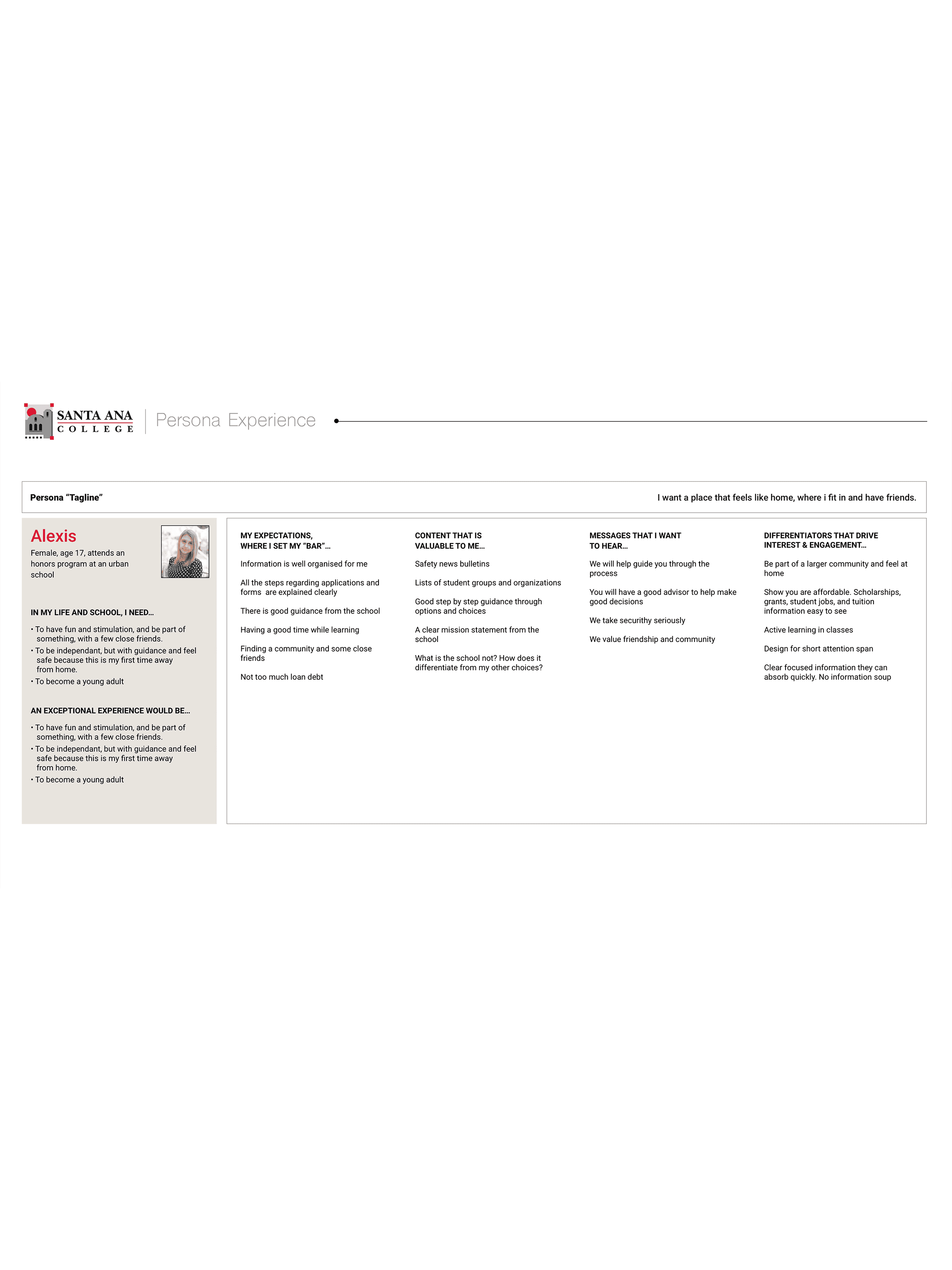
Two main personas were identified: "The Prospective Student" and "The Continuing Education Adult." User journeys were mapped to identify key touchpoints and opportunities for design improvements.
Ideation and Sketching
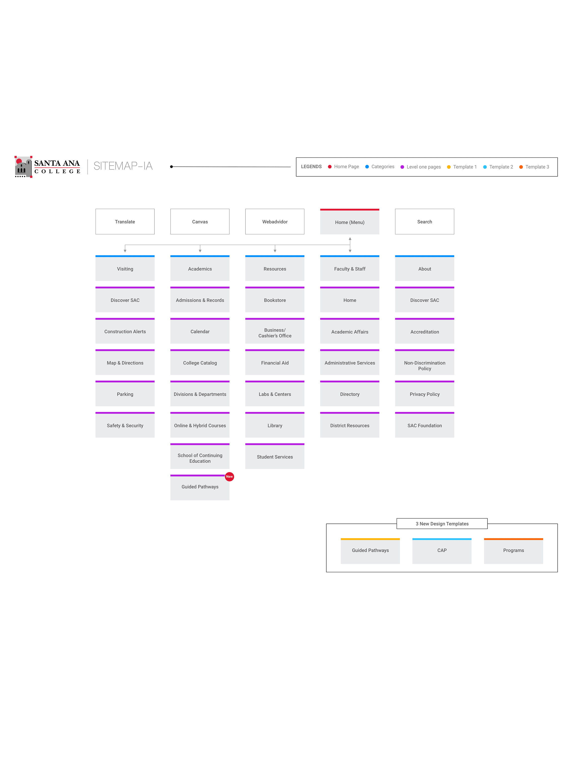
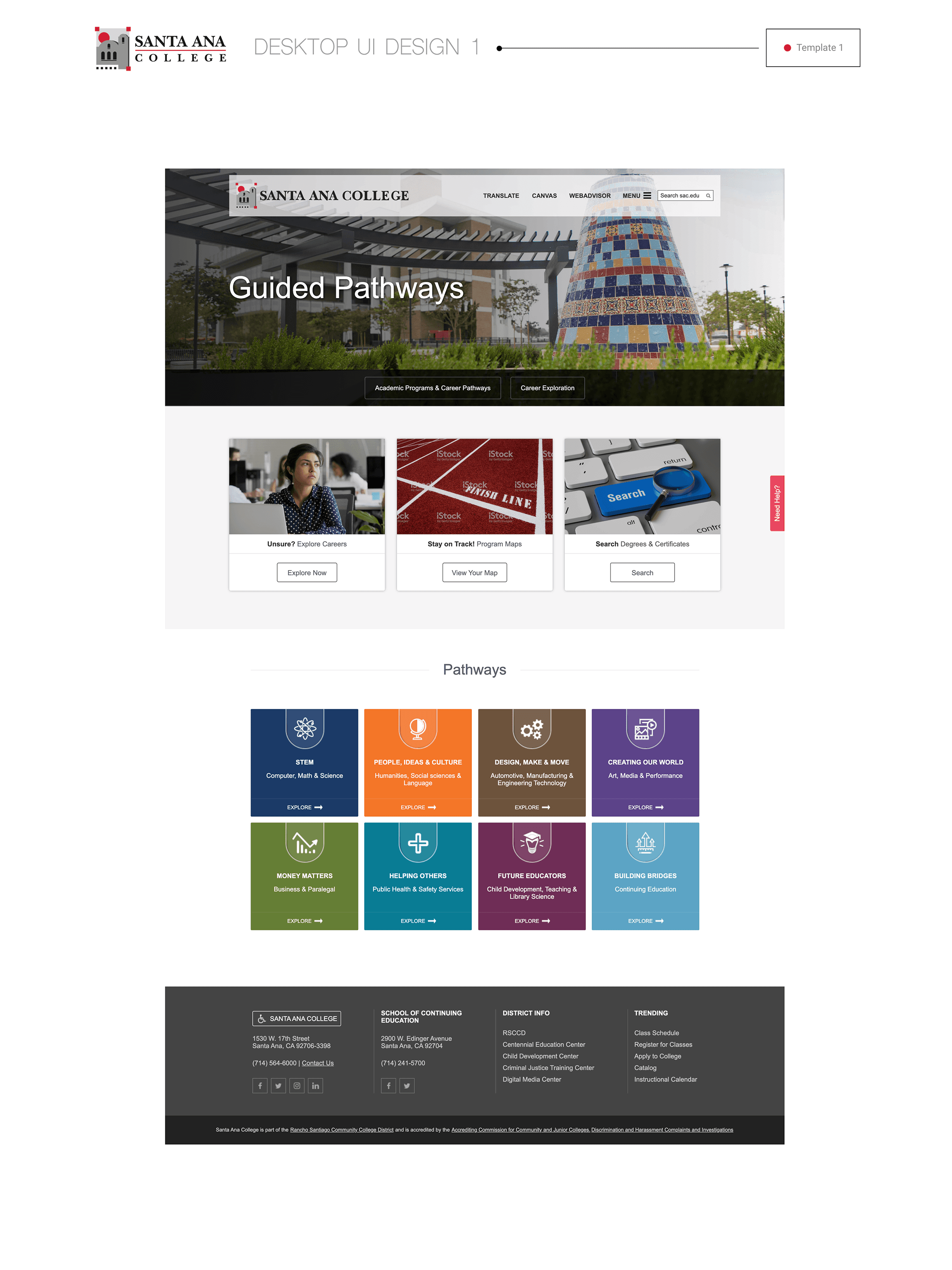
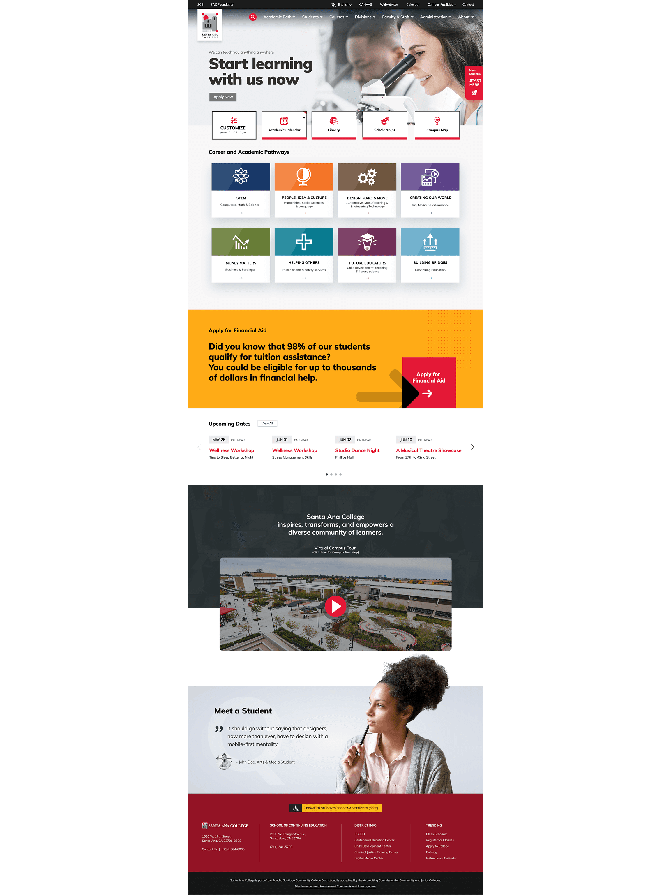
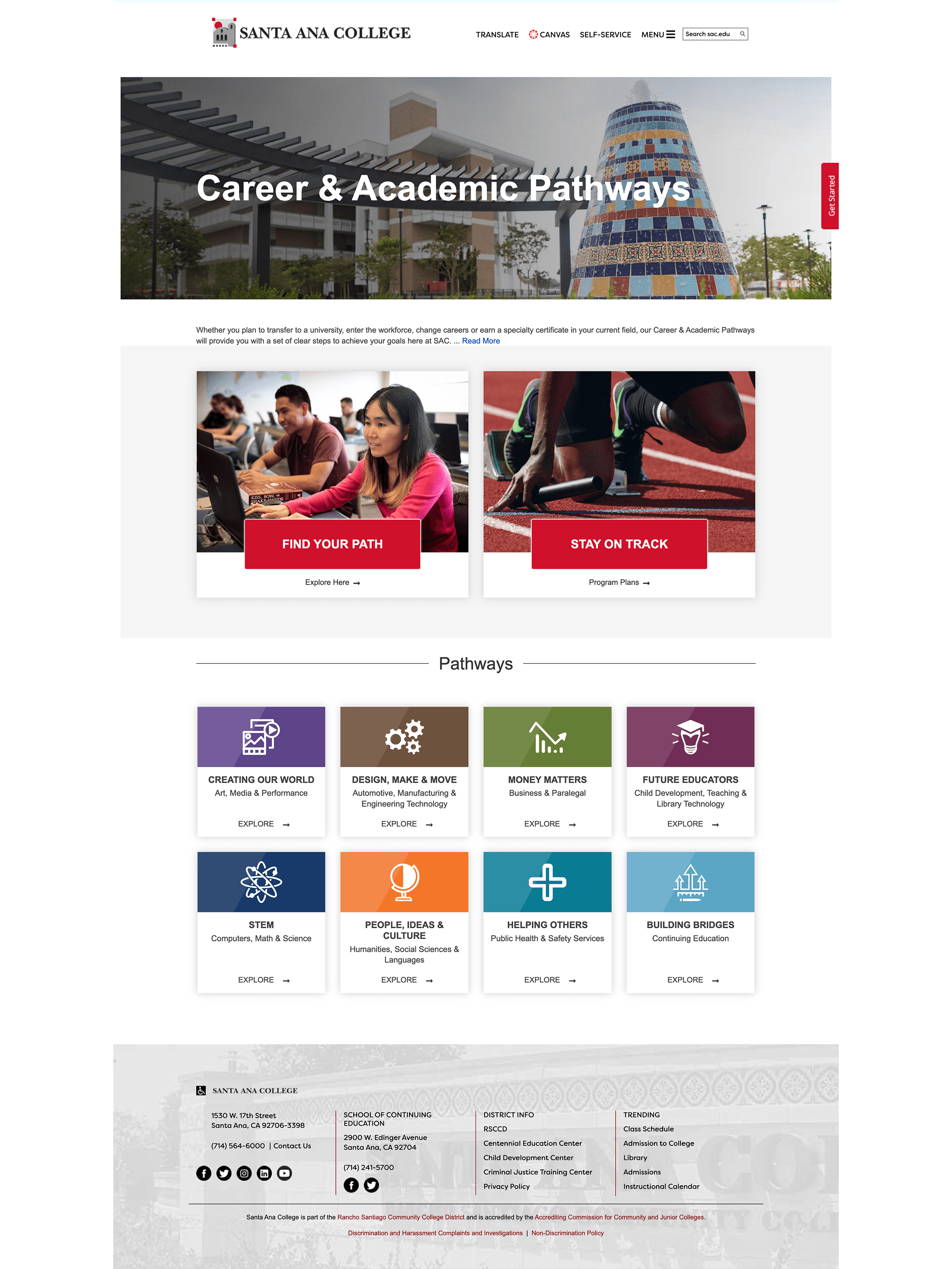
Initial sketches focused on a hierarchical structure to accommodate both CAPs and non-credit programs. Wireframes and mockups were created, adhering to SAC's Visual Identity Standards and color coding for the CAPs.
Prototyping
A clickable prototype was developed in Axure RP, featuring reusable layouts/templates for SharePoint 2016 implementation.
User Testing
Two rounds of usability testing were conducted with our user personas. Feedback led to refinements, particularly in the presentation of CAPs and the navigation menu.
Accessibility
The design complied with ADA and WCAG 2.1 at the AA level. SAC and Rancho Santiago Community College District were consulted to ensure full compliance.
Final Design and Implementation
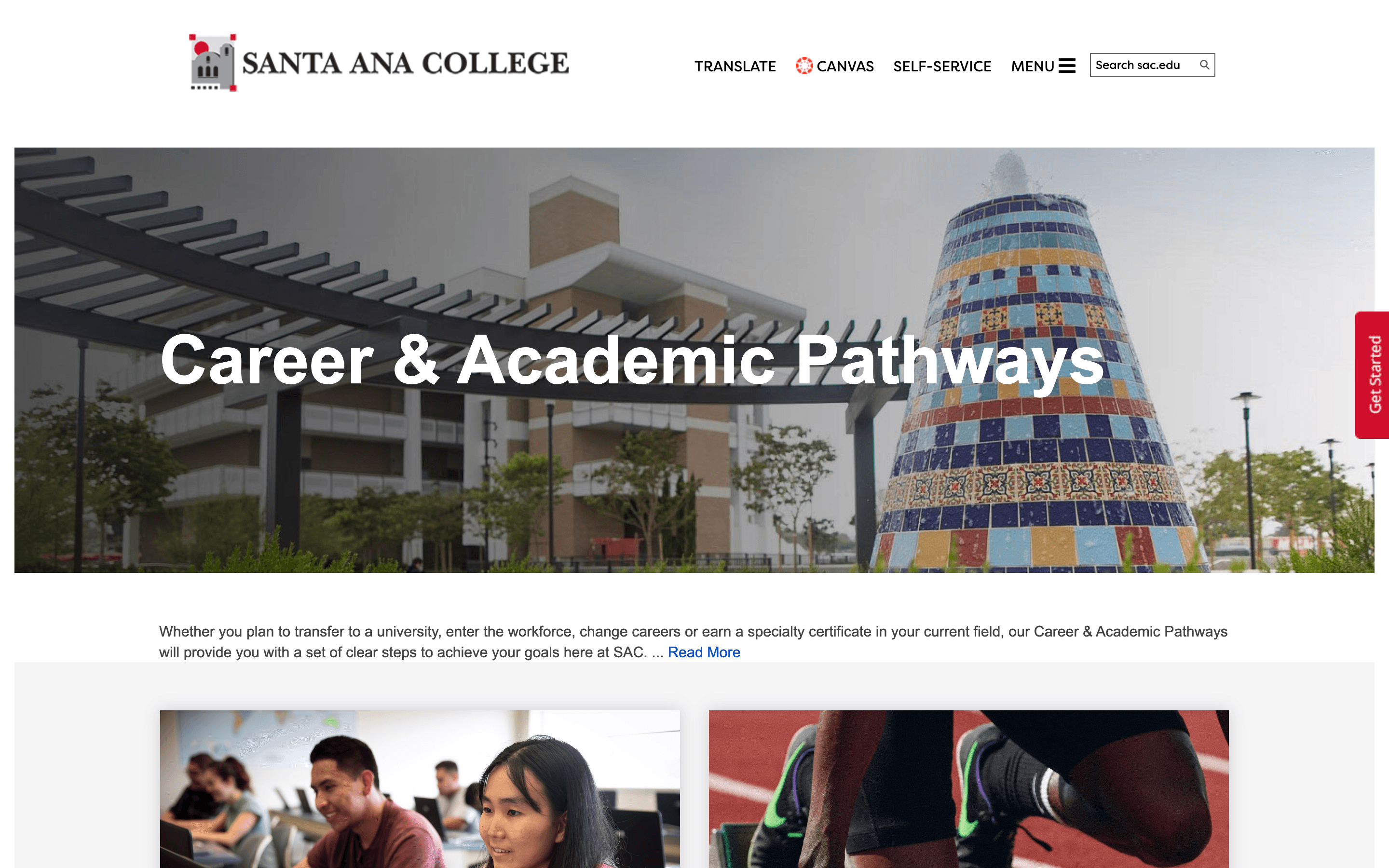
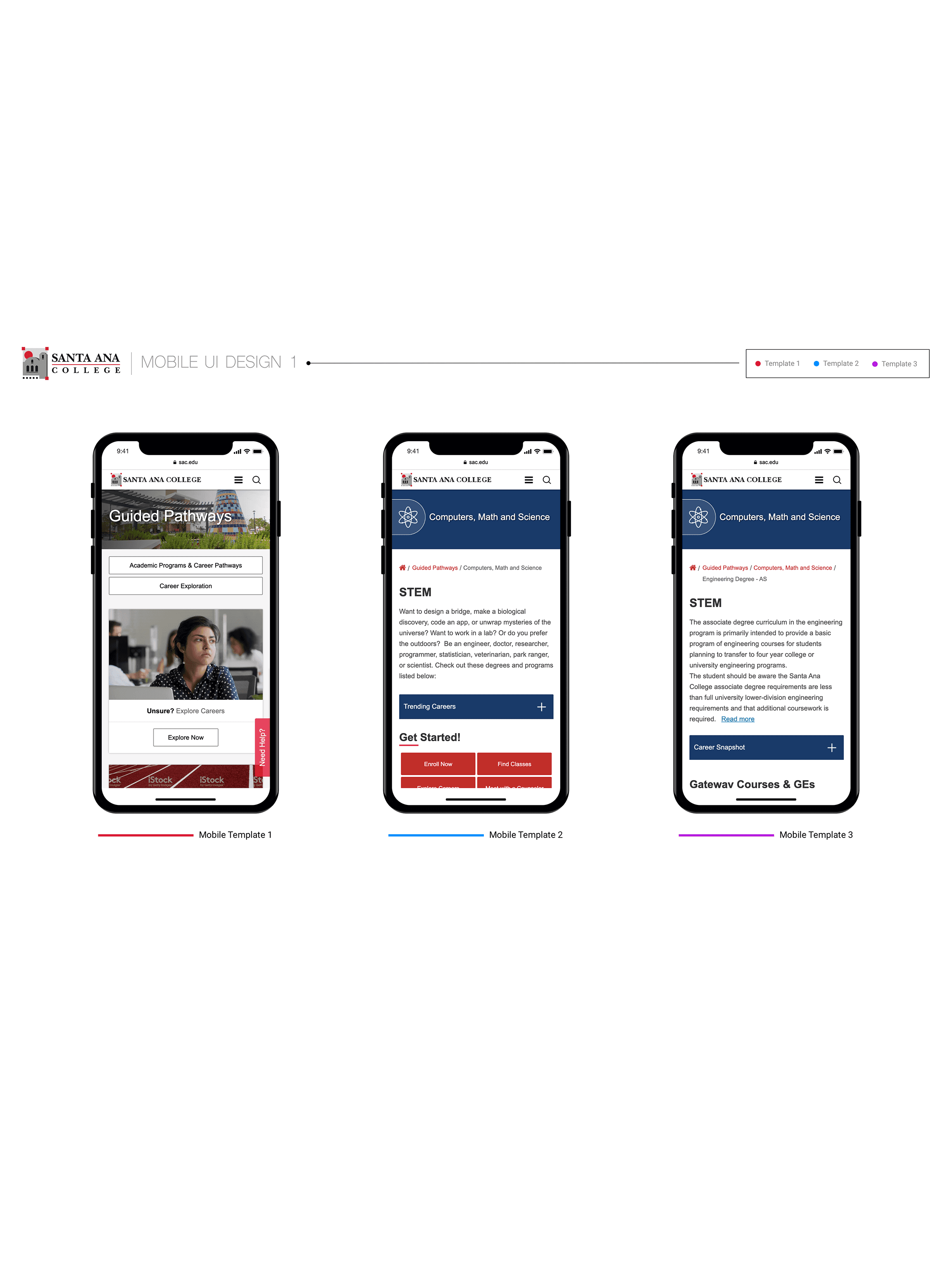
The final design included a streamlined navigation system and improved content layout, all built in SharePoint 2016 to be responsive on the 6 most common screen sizes and devices as per Google Analytics.
Results and Metrics
Post-launch, the site experienced a 20% increase in user engagement and a 15% reduction in bounce rate. Usability scores significantly improved, especially among prospective students.
Reflection and Lessons Learned
The phased approach was beneficial for incorporating user feedback. Future phases may consider revisions to SAC's Visual Identity Standards, based on user interaction data.
Conclusion and Next Steps
The redesigned SAC website is not only compliant but also more user-friendly and effective in guiding students through their academic journey. Future updates are planned to maintain and improve upon these successes.
This case study demonstrates the holistic approach we took to meet both organizational guidelines and user needs in a complex, regulatory environment.
